By Andrés-Sebastian Meléndez Muñoz and Adriana Vélez
The exhibition is a collaboration between Sui Park and Caitlin Teal Price. It consists of sculptures by Park and paintings by Price, both of which explore “the metaphysical nature of object making and the artists’ relationship to labor as a connection to the natural world.” The exhibition features bright, saturated colors, the manipulation of light, and the exploration of space. This exhibition is no longer available to see in person and is only accessible via Mono Practice’s website. Biomorphic Structure’s designated section on the site consists of a slideshow that allows for each piece to be viewed for 3 seconds before changing to the next one. The two writers of this piece had to do an online exhibition due to the fact that they were in two different parts of the country, over 1000 miles away.
Adriana: The first thing I notice as I try to browse through the exhibition is the website’s timer on the photo slides. We only get around 3 seconds for each picture before it automatically switches to the next one. It feels counterintuitive and hinders the experience considering gallery spaces are designed for viewers to be able to spend as much time as they want in front of a piece. Despite how annoying this feature is, the pictures chosen for the photo slides efficiently depict the gallery space and the pieces of the exhibition, considering the sculptures rely on their relationship to the space they’re in.
Andrés-Sebastián: I have to agree with you, Adriana. I have seen online exhibitions with automatic timers, but this one was particularly fast. When dealing with realist art, naturalistic art, or works of art where you know what everything is, the short timer is not as big of a deal because you can quickly see which pieces are what and know or understand what they are. In this case, the short timer is especially important because neither one of us knew what we were looking at and the shortened time made it even more difficult to actually see the work and take them in.

Gallery Space
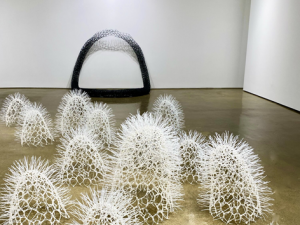
Adriana: That’s very true. The sculptures are quite abstract and I think they require more time for observation so that we can make our own interpretation of them. We even realized after a long period of time that they are made out of colorful zip ties, which we would’ve probably realized sooner if we were in person at the exhibition. Because we read the description of the exhibition, we already know it’s heavily inspired by the natural world. Upon first glance, the sculptures remind me of underwater creatures, especially the ones titled Sprouts. They could have easily blended in with the underwater kingdom in Disney’s The Little Mermaid.
Andrés-Sebastián: 100% accurate. It took me so long to realize that the work Loop was made in zip ties because it was hard to focus on it and because there is really no description about the work. Remember when I mentioned how it looked like a Megalodon or giant shark mouth? It reminds me of the one at the top of the steps in the Baltimore Aquarium. What is shocking about some of these pieces is how dense they look in the moment. It was so difficult to tell Loop was made out of zip ties until you mentioned it and I looked really closely. You are keeping me on my toes. The issue was I had to keep going back to the picture by clicking on the photo because it kept changing. The exhibition is good, but there is a decent amount they could do to make it better. I think the descriptions of what the exhibits are needs some sprucing up as well.

Loop, 2020
Black Cable Ties
4.5 x 5 x 4.5 feet
Adriana: I agree, the website really needs work. The sculptures vary so much visually that it was hard to make out they were made out of the same material. Park did an amazing job in making the sculptures look really dense and heavy and having others look really light. Loop is especially stunning because the bottom of the piece is so dense and it slowly starts getting more sparse and “see-through” as it flows upwards. Something I really like about this piece is that it involves the space it’s placed in. Because of the angle the sculpture is in, the inside of the loop is divided between the floor and the wall of the gallery. The experience of seeing this sculpture would be completely different if it was in another room. This really translates well online and the piece doesn’t suffer at all.
Andrés-Sebastián: What you say about Loop is true, the brown colored pattern of the floor combined with the density of the lower half of the sculpture gives it an appearance of a snake slithering through the dirt. The pure white of the wall and the thinness of the upper half of the sculpture made it blend into the wall to the point where I really needed to look at it in order to see that most of what I was seeing was actually the wall. I have to say though, that I think the most impressive of all the works were the Hidden Gem sculptures by Sui Park which are hand dyed zip tie sculptures that hang on the wall. They are so impressive to me because they look like they are glowing, even though they are just zip ties. They look like dragon eggs. They are so simple and yet there is a hidden complexity that entangles the viewer, draws them in and holds their gaze.

Hidden Gems, 2018
Hand-dyed Cable Ties
Adriana: The Hidden Gem sculptures are really stunning. The saturated colors of the zip ties and the white wall the sculptures are mounted play off of each other, which I think is what gives them that glowing quality. They’re similar to the Loop in that they would be a different experience as well if they were mounted on a different space. These pieces are an interesting study in space, since the burst of colorful zip ties are kind of trapped inside of the black outer shell. Out of all the sculptures, I think the ones that suffer the most in the translation to an online space is Sprouts. They’re placed on the gallery floor and in the in-person exhibition, we would’ve had to walk around them to view the other pieces. That interactive element is lost in standard photography.
Sprouts, 2016
Cable Ties
Andrés-Sebastián: Spot on, Adriana, if there is a victim in all of this, it is Sprouts. The works themselves look really awesome. They remind me of so many things at once, like sea urchins, or the leeches in the 2005 remake of the movie King Kong when the protagonists are stuck at the bottom of a dark ravine, and these leeches emerge from the ground and start eating people. Those are just two examples of many. But due to the fact that they are just photographs, the excitement of these works are cut short because you know there is so much more to them if you could only see them in person. Sadly, we must adapt and overcome, and make due with lifeless photographs. I think the artists could have given the viewers more if they had put together a video going around the works, under them, and over them. It is still not comparable with viewing and experiencing it in person, but it would surely add to the beauty and fun of the works.
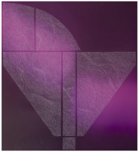
Adriana: They definitely remind me of sea urchins and each seem to have their own personality with the way they point in different directions. They’re such fun pieces and the fact that they’re multidimensional and interactive is such a loss. A video would’ve been a great way to capture Sprouts and we would’ve also been able to get a better grasp of the dimensions of the sculptures. I think they’re my favorite out of the sculptures, which is why I’m so disappointed in the execution of the documentation. Moving on to the paintings, they are so visually stunning and complementary to the sculptures. The bright color aesthetic is carried throughout all of them, as well as the play and manipulation of light. However, I personally don’t see them as all cohesively being part of one collection. Untitled Blue, Untitled Pink, and Untitled Yellow are more elaborate than the rest and the element of lighting is much more precise. The other paintings look more organic, for lack of a better word. It’s important to consider that they might not seem to fit in because of the order they’re being presented in on the website, but I’m not sure.

Untitled Blue (ghost), 2020
Xacto Blade Etching on Pigment Print
20 x 24 Inches
Andrés-Sebastián: By golly, you don’t miss a beat, Adriana. I have to say, if you did not point out half of the things you do, I might miss a lot. There really is no description on the order or much information about the paintings in general. I agree that some are oddly more organic than the others, but they do all seem to be somewhat connected in that they could all pass as a study in the way the colors change with regards to light. Potentially, there also seems to be a similar factor in that they could all have been done using a black background, as if the canvases were painted black before the actual works of art were painted over top. Due to the little information we have, and the fact that they are only pictures of the paintings, it is difficult to say with 100% accuracy as to the truth of that statement. The other factor that is intriguing to me is that the paintings that are more organic [Untitled Pink (Diamond), Untitled Blue (Ghost), Untitled Yellow (Asphalt), and ROYGBY #1] are all next to each other and the ones that look more planned or like color studies are all side by side as well. The two kinds are set up in a way that they do not mix together. This in itself can be an intentional pattern, that once again can not be confirmed with 100% certainty.
Adriana: The pattern seems to be intentional considering the paintings are grouped that way. A video with a 360 degree view of the gallery room would have answered all these questions pretty easily, but we are left wondering the meanings and connections behind these pieces. The paintings, however, lend themselves beautifully to photography because they’re like a study of lighting. As I look at them, I keep forgetting that the colorful lights are actually painted and not the reflection of a nearby colored lightbulb. I can’t imagine what the painting looks like in person, but it certainly thrives as a digital image, almost like it was meant to be viewed this way.
Magenta #2, 2019
Xacto Blade Etching on Pigment Print
35.5 x 32.5 Inches
Andrés-Sebastián: Overall, I would say the exhibit itself is really fascinating and very beautiful, even if I think the online format and structure used was a bit pedestrian. The colors and choice of simple backgrounds complimented each other perfectly. This sounds weird, but there seemed to be a perfect balance of simplicity and complexity. So many of the pieces were so simple when looked at, at first, it was not until you zoomed and saw them up close and from different angles that you realized just how intricate each individual piece was. I strongly recommend that people go online and take a look at this exhibition. It is fun and allows the viewer to interpret the works however they want, though I think that the pieces are inviting in a joyful manner.