The exhibition I saw was: Louise Lawler’s Tracings for You -by Andrés-Sebastián Meléndez Muñoz
It is important to start out by saying that what I looked at was not actually an exhibition at all, but more of an exercise done by the artist in order for people stuck in quarantine to be able to partake in artistic endeavors during the pandemic. I will refer to it as an exhibition from time to time. The collection of works is a vast assortment of drawings in pen on paper done by the artist as copies of famous works by famous artists with the purpose of being downloaded by old and young people alike to be colored in or used however they like. Louise Lawler is a photographer who takes her images and changes them into a lot more than just photographs. In this particular case, she has taken famous images and morphed them into something new. The artist has changed the way we think of art by really making it work for her. She rebrands, and reshapes already finished pieces so as to be able to use them again or to be able to fit them into a new space. She wants these pieces to be interacted with. The artist does not want this art just looked at, and this exhibition or exercise is a perfect example of that.
This online experience starts by giving the viewer a long rundown about Louise Lawler and her work. There are three paragraphs about the kind of art she does and what she aims to accomplish with the works of art provided. I actually appreciated this because I had never heard of Louise Lawler and this gave me relatively quick “need to know” facts about her that I think helped me appreciate her drawings more. If I had clicked on the link for this page and just been thrown into it with no explanation of the artist or her work, I think I would not have liked her work and thought it very childish because I would just see them as mediocre drawings or tracings of famous pieces. The explanation gives me enough to realize what the artist’s goal is but not too long that it bores me before I see what is on the page.
I will say that it is difficult to master any online art set up due to the fact that the viewer is often seeing a flat picture of the work. In this particular case, I think they could have done a better job because these works of art are just drawings or tracings and are very flat pieces of art. This caused the pieces to get a little tedious to look at and it lacked life. There was also not enough color. I think they could have had a video of people coloring in some of the works or images of the different ways her projects have been used like it mentioned in the initial paragraphs that I read before seeing the tracings.
None of the images stuck out particularly more than others and I think that is because these are meant to be downloaded and printed and then used however the viewer wants, but as an artist I know that not everyone will be at the same skill level even for coloring so I like the fact that some of the tracings are more difficult than others. The first piece shown is a match print on vinyl adhesive and vector-based illustrator named Still Life (Candle) (Traced) and I would say it is of medium difficulty because there is a lot of open space but in the center of the work there are a lot of smaller objects and little parts that could be difficult to color. The still life is two wine glasses on a table with an ashtray full of smoked darts and some glasses and two plates, and some other objects backed up with part of a window and wall as the backdrop. This piece this a tracing based on an original of Louise Lawler.
-(traced).jpg)
Still Life, Candle (Traced), c. 2000 / 2013
The second work I chose is also based on an original by the artist Louise Lawler. It is gouache on archival pigment print called Berlin (traced). I actually think that most of the works are easy enough for most people to color in, with a few exceptions that have some small areas on them that could prove to be difficult. Berlin (Traced) is one that I would say is an easy one to color. It depicts two “images” hanging on a wall with a little bit of floor showing, separated from the wall by the baseboard and shoe mold that moves horizontally across the piece. Then at the bottom right, almost at the corner, there is what looks like part of a chair in view.
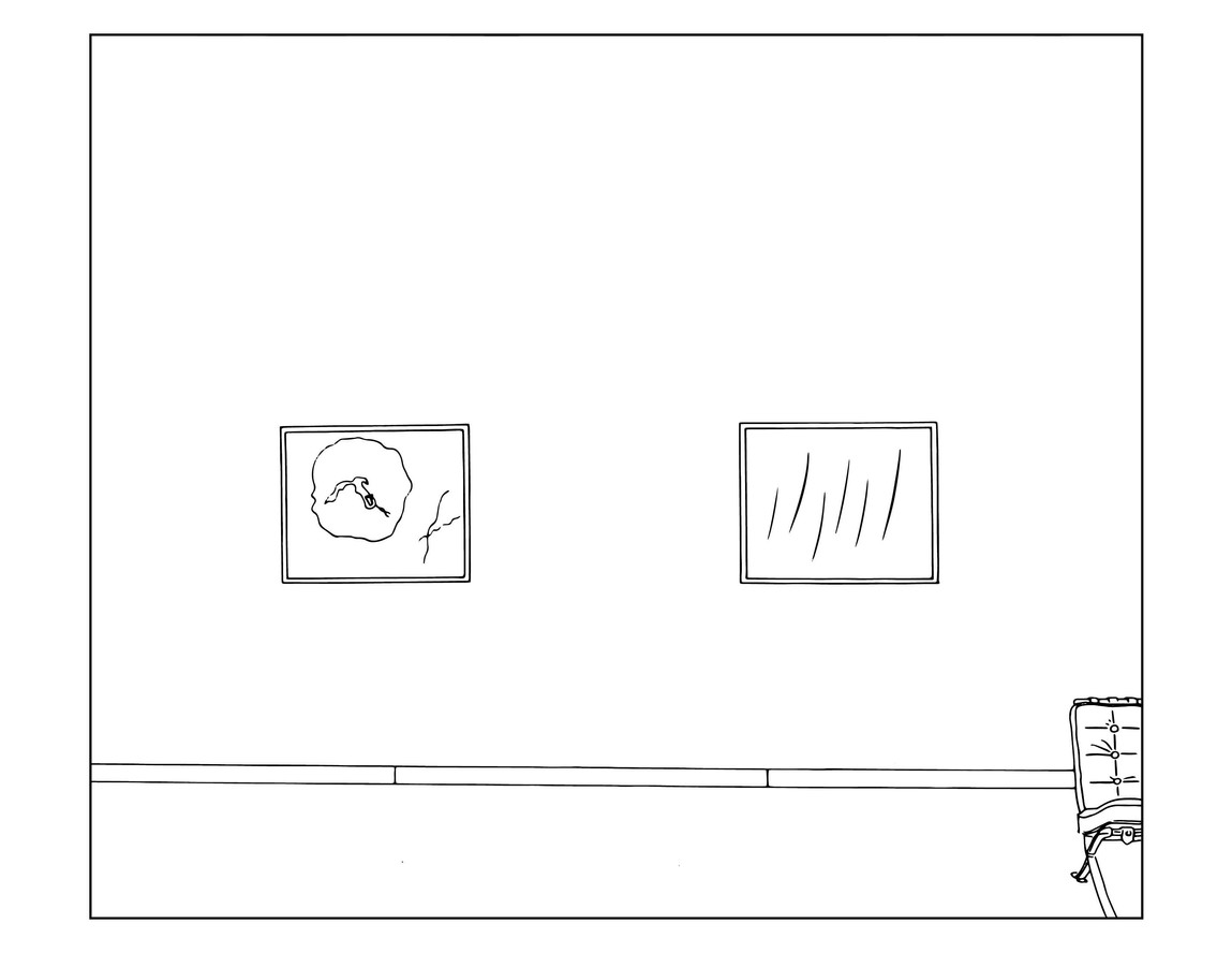
Berlin (Traced), c. 2000 / 2013
It is important to note that the three images I chose to write about are all based on works originally done by Louise Lawler, though not all of the works shown in this exercise belong to her. Many of them are copies of some very famous and iconic works. The image titled Bunny is a piece originally done by Jeff Koons, of the same name. His works are very well known and sought after by even the most high end collectors.
Another notable name shown in this “exhibition” is Pollock and Tureen which depicts a Jackson Pollock painting hanging with just the lower half visible and a detailed soup bowl on a thin wall table between the viewer and the painting. This photograph was taken by Louise in a private home of a very famous collection of works belonging to Mr. and Mrs. Burton Tremaine. It is important to mention these notable names because it says something about the photographer. Her name carries weight in the art world, she has a status as an artist that allows her to take master works and change them however she wants.
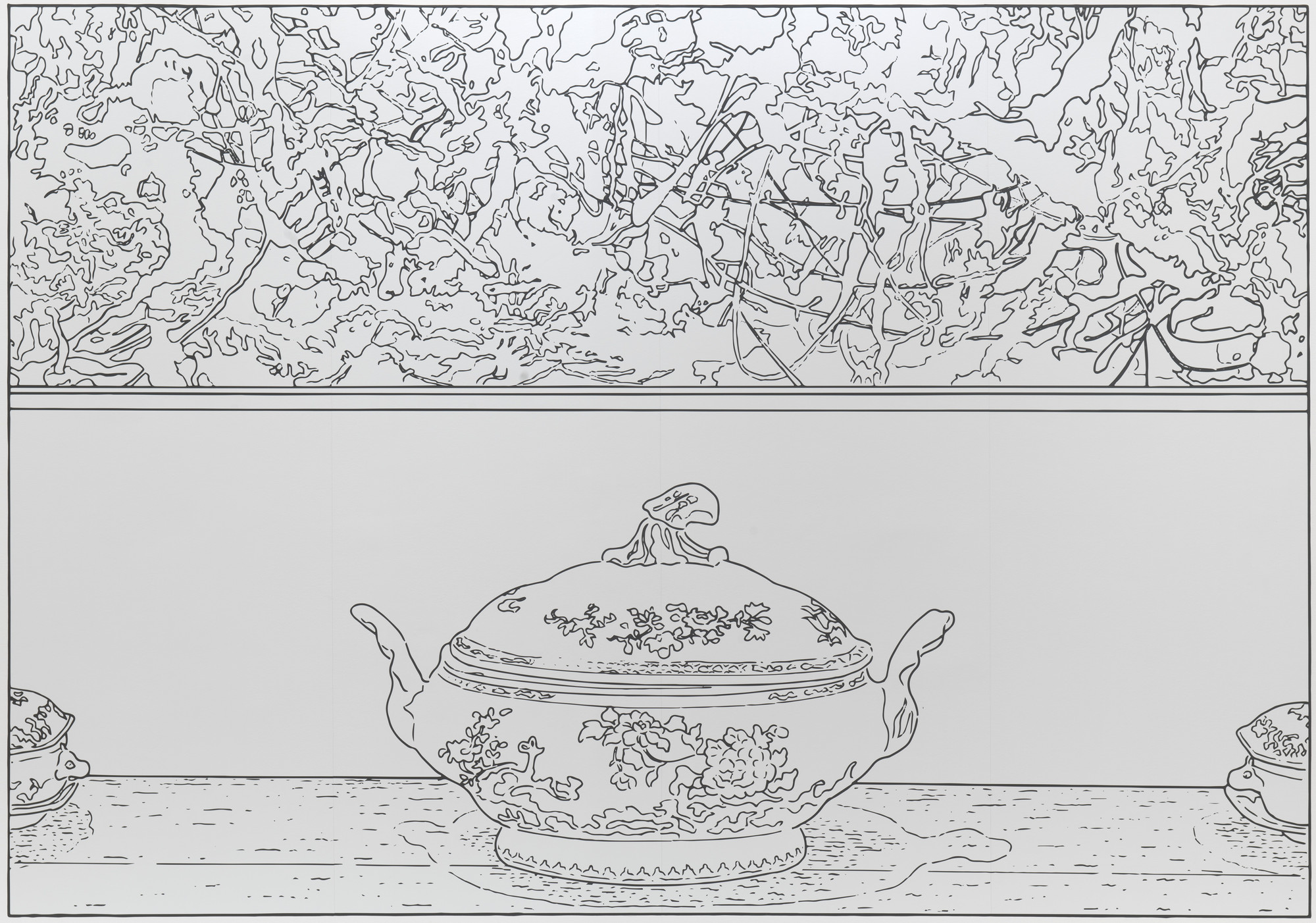 Pollock and Tureen, (Traced), c. 1984 / 2013
An example of an image that could prove to be difficult for many to color is Egg and Gun (Traced) which is actually an original piece by Louise Lawler, originally done as a cibachrome face mounted to plexi on a museum box. I did not add an image of Egg and Gun (Traced) because I did not want to spoil all the pieces for the reader. I chose this one because it has a lot of different parts and areas that have many small places that need to be colored in. In the top right corner of the work, there is a flower, perhaps a rose leaning slightly left. Next to the flower, taking up the middle top of the work, is a gun pointing down with the magazine going towards the left. The left side of the image is difficult to describe, it looks like a gathering of people, With no real details to them, maybe in a bar-like environment, but the bar is turned sideways and the heads of the people are pointed towards the right. Underneath that and to the right of that, there seems to be what looks like an art gallery, but the viewer is seeing it from a strangely warped perspective. It looks like you are looking at it through one of those wavy mirrors you see at the county fair that makes everything look wobbly or funny. This image has so many little intricate parts that could be difficult to color so that is why I think it could be labeled as difficult.
This exhibition, like all, has pros and cons. The biggest thing was the lack of color, I think they could have added more to keep the viewer excited after they have been reeled in. That being said, the website is very easy to use and accessible. I am not at all tech savvy and I found it very easy to navigate and easy to zoom in and look more closely at the images of my choosing. The link to download and print the images is also very easy and is located right there in the center of the page, right after the three opening paragraphs. Louise Lawler is making viewing online art more interactive and finding new ways to engage the viewers in these times where so many of us are working or studying from home, and I think that is awesome. I personally don’t think I will color any of these works, but I know I will show many people this website because I think the idea is awesome and wholesome. It may also get more people to think about art, and that is always a good thing.
Link to the Exhibition: https://www.moma.org/magazine/articles/257