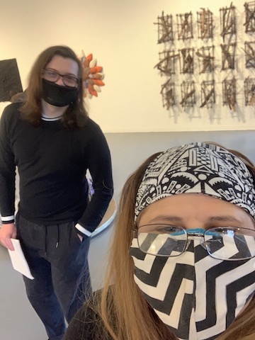
By Sandra Abbott and Pierce Johnson
On Saturday, April 24, 2021, I arrived at the Creative Alliance at the Patterson in East Baltimore. It’s a vintage theater still festooned with a huge vertical deco marquee. The old “Patterson” was converted into a multi-disciplinary community arts hub in the 1990s. Ever since they’ve shown everything from local and traveling music acts, burlesque, comedy, film fests, lectures, and visual arts exhibitions. They also host a mind-numbing array of school, community, and family educational programs and organize local art parades and festivals.
I’m a few minutes early and take the opportunity to address my long overdue membership renewal while waiting for my partner Pierce Johnson to join me. His long journey from Annapolis forces him to seek out a restroom before heading inside.
Full disclosure. This being “Smalltimore,” I know the curator and several artists in one of the exhibitions we’re about to see. I’ve enjoyed a long and storied past with the Creative Alliance at the Patterson, having lived just one block north for several years. I even saw Jaws and the first Star Wars movie here when I was a kid in the mid-1970s when it was still a movie theater.
After sharing a quick personal history of the place with Pierce, we are ready to see the show.
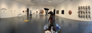
We walk into the space. There is no way to tell this 2,000-square-foot white box gallery previously functioned as a movie theatre for most of the 20th century. Today there are no electronics, time-based work, or paintings here–just several large sculptures in the middle of the vast single-room gallery.
This is essentially a traditional sculpture show with several 3D objects protruding from the walls and a few pedestals sprinkled about for good measure. There’s a single wall didactic, which along with the printed checklist, we decide not to read.
Dates: April 17th to May 29th
Curator: Thomas James
Online: https://www.creativealliance-onview.org/organic-destruction
Artists: Kyle J Bauer | Christian Benefiel | Yam Chew Oh | Brandon Donahue | Nicole Fall | Stephanie Garmey | Stephanie Garon | David Gleeson | Grayson Gross | Artemis Herber | Andrew Hladky | Jason Hughes | Sam Husseini | Jeanne Keck | Shelley Picot | Michael Thron | Omolara Williams McCallister | Marcia Wolfson Ray
CREATIVE ALLIANCE AT THE PATTERSON
3134 Eastern Avenue
Baltimore, MD 21218
Instagram Facebook Twitter
info@creativealliance.org
Sandra: Did you see the advertisement for this gallery and exhibition?
Pierce: I did not, I didn’t really look at the advertisement. I wanted to go in blind.
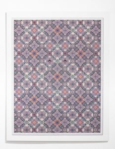
Sandra: In the advertisement for this show, I remember seeing the names of a few artists I recognize. This work is the only truly 2D piece in
Sandra: In the advertisement for this show, I remember seeing the names of a few artists I recognized. This work, the only truly 2D piece in the show, is by Jason Hughes. I know Hughes from UMBC. He graduated a few years ago, and he was lucky enough to get a solo show for his MFA exhibition. Standing in front of this large digital collage, I recognize the work as typical Hughes. I may have even seen this piece before at Jordan Faye Contemporary. It’s a grid–a repeating medallion pattern–of images resembling parts of US one-dollar bills. In the center, it appears someone is peering out through two disembodied eyes, staring out at us like someone behind the wall where an old portrait is hung in a Vincent Price horror movie. It looks like he photoshopped the eyes from the one-dollar bill.
Pierce: Like the “Illuminati” eye on the back?
Sandra: Yeah. Hughes’ work was all about money. I hate to say it because it sounds pejorative, but it’s a bit “decorative,” isn’t it?
Pierce: Well yeah, I was thinking about the classic Arabic or Persian rugs. It reminds me of that, but when you really start to look at the colors and the designs and everything, you really start to realize this is composed of currency.
Sandra: It’s immediately recognizable to me as a Hughes and a reference to US currency. Look, it’s the exact color. But this time, I’m struck by how the medallion pattern functions overall. It’s so subtle. It forces me to consider something small that we take for granted in everyday use, but on this larger scale. And it’s really pretty! Like… it would look great on my bathroom wall, like some nice tile work or something. But the eyes are a bit creepy.
Pierce: It’s a bit creepy, but I think it’s perhaps forewarning. I don’t know if that’s the right word, but basically, it’s watching you. It’s controlling you, maybe even stating how we’re each bound by our financial status so to speak.
Sandra: Uh-hmm. It definitely carries those ideas–like big brother watching over you.
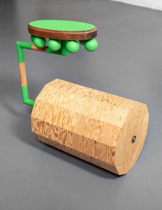
Sandra: This next work is by another artist I know. I immediately spotted his aesthetic. He makes objects with raw plywood and then paints some parts in bold color-blocked sections. His aesthetic always reminds me of classic, mid-20th century Fisher-Price toys scaled up to adult size. At his day job, he’s a conservator at either the Walters or the BMA. Can you tell? His work is precise and meticulous. So what does he have here?
Pierce: It appears to be a polygonal cylinder with 12 sides. It is connected to some sort of stool, giving it the appearance of a wannabe unicycle.
Sandra: Yeah. That’s what I remember about his other work too. His sculptures tend to suggest kinetic components. The bottom half of this sculpture reminds me of a giant paint roller, only the barrel of the cylinder has ridges. It’s not a smooth cylindrical form. Also, the seat of this “wannabe unicycle” has several bulbous shapes connected underneath it–like large green teardrops falling from the seat of the same color. Are they light bulbs?
Pierce: I was going to say they look like limes growing off a tree.
Sandra: It’s scary because they look really fragile–especially if they’re light bulbs. But he’s a conservator, so he can fix that if they break. The way this thing is constructed–the primary components pointed in opposite directions–you couldn’t roll forward. You’d have to roll… sideways perhaps? It’d be a damn bumpy ride too.
Pierce: It would be like going over a speedbump each time it rotates around if you were to actually ride it. If that’s even possible.
Sandra: Yeah, really uncomfortable too. Right?
There’s a sort of William Morris craftsman-like “truth” to the construction of this thing–or so it appears. You clearly see how it’s made with simple hardware. It really does look like the barrel of the cylinder could be rotated and moved. My impulse is to go over there and try it, but I know we can’t do that, of course.
Pierce: Well, it could also be saying it looks functional, but it’s dysfunctional on purpose.
Sandra: Maybe it’s one of those pieces where artists get onto it and do a performance at some event. We had an exhibition at the [UMBC] gallery recently where kinetic sculptures were activated by the artist at various times throughout the run of the show. I would love to see somebody try to get on this funky unicycle. They would risk breaking those bulbs certainly. And if they do, does the whole thing become a torture device? Or is it just problematic in that you’ve got this “fragile thing” in between your legs? And, oh my! Ouch!
Pierce: Alternatively, it could be they end up sitting on it, the light bulbs break [if that’s what they are], and then you get this device breaking and crunching as it rolls over the pieces.
Sandra: So it could be audible in addition to being kinetic. But even if it isn’t, it still presents the hazard of using the object in that way. Ultimately, its construction is not conducive to what it seems to be suggesting in terms of use. What do you think that means?
Pierce: I guess you could think of it like car companies who’ve had to recall [their products] because various parts aren’t working, like airbags, seatbelts, and other safety devices. You can kind of equate it to that. They’re making something that isn’t fully ready for use and perhaps even hazardous.
Sandra: Then it addresses our inability to realize our nifty “bright” ideas when we fail to put them into practice. If those “bright idea” bulbs suggest our inability to deal with energy efficiently, then this piece is starting to depress me. What a shame. We had gotten off to such a great start with the whole 1950s collectible toy aesthetic with this piece. This is one of those tricky shows that starts out all upbeat and then sucker punches you when your guard is down. Isn’t it? Please tell me there is something hopeful next.
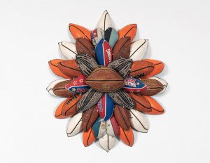
Pierce: When we first entered, I kind of gravitated toward this piece. My family is big into sports with my parents working in [the industry]. And I guess I have a weakness for floral designs and patterns, hence why I was intrigued further by it.
So we’re standing in front of a work that is a flower of sorts. But it’s composed entirely out of basketballs. I like how there’s disparity in age and type among them. You have ones that are Harlem Globetrotter souvenirs, ones that are well used and worn out, and some that have been used gently, or perhaps not at all
Sandra: There’s a nice mix of texture, color, and shape here. It reminds me of a button chrysanthemum. The flower is assembled very tightly with several layers radiating out from the central button. The “pedals” are made up of elliptical shapes cut from the basketballs.
Pierce: I guess when a basketball ultimately deflates, it becomes unusable. We assume its life is over. We often just toss it out and throw it away. It’s useless [we think]. But the artist clearly found a way to repurpose it, and make it something beyond its original function, something beautiful and decorative.
Sandra: That’s kind of what happens with flowers too.
Pierce: Yeah. You can do everything to prevent the demise of this equipment, but they will eventually wilt away. But in this case, you can see that there is a way to give them a new life.
Sandra: It’s a very cool way to upscale sports equipment for creative purposes. I like the well-worn look of it. It’s a very cool object, and I’m glad you pointed it out. It didn’t immediately speak to me as it did to you because you’re steeped in that culture.
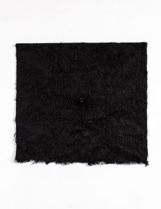
Sandra: What’s going on with this next one?
Pierce: I will say with this one, I want to pet it. Obviously, I can’t, but it reminds me of a bear rug or animal pelt.
Sandra: We’re looking at a square of something furry. Without checking the show’s printed checklist, I’m not sure if it’s real wool, real fur, or something else. And there’s a protruding object of some kind–dead center. What is that?
Pierce: It’s a snout. I’m just hoping it’s not from the same animal, and I hope it’s not real.
Sandra: It looks like painted wood or a ceramic carving. Animal politics is a thing now. Depending on what the materials are, one could feel very differently about a sculpture.
Pierce: It’s making me ask, “Is it real or not? Did an animal die for this work? Or did they just go to a dog grooming place and ask for all their black fur?”
Sandra: Because that has implications, right? If it’s real fur, you start to question that and you wonder what the value of that animal is. And then if we’re questioning an artist’s materials, should we question ourselves? Tons of stuff we consume every day has animal products, and what are the ethics of that? It’s something that I struggle with all of the time.
Pierce: Yeah. You ask yourself, “What is the right balance?” When you’re going to the grocery store and buying meat, it’s like, which brand do I do? The one that’s from a factory farm or do I go for the more expensive, organic stuff that’s guaranteed to be better for both us and the animal?
Sandra: Yes, it has economic implications for us too. Critics say some people are not in a financial position to be able to go vegan, for example. I tried going vegan for about two days, and I failed miserably! For me, this is a very timely piece about food equity, animal politics, and the power dynamics of who gets access to “resources.”
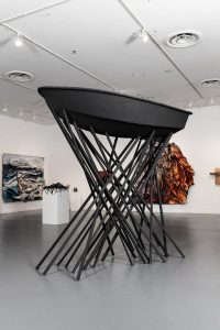
Sandra: Now, this next piece you can’t ignore. It’s in the center of the gallery. It looks like they took a rowboat off the shelf at Dick’s Sporting Goods, painted it black, and erected it as high above the ground as they could. We only see the bottom of it because of that. The work is supported by 30 sticks of two-inch trim molding. The sticks are woven together. It doesn’t look like they’re actually attached, but it looks like they’re interlaced, like the huge game Pick-up Sticks. And at the top of them, this boat is placed very precariously. Is it even attached, or is it just sitting up there?
Pierce: Some screws appear to keep it upright, but they’re almost concealed.
Sandra: Yes. A couple of them are attached to the boat. I’m glad to see that here because it’s pretty big, and I’m afraid of it falling on someone!
Pierce: Hopefully, nobody knocks into it by accident.
Sandra: And it’s all the same matte, black color. What is going on here?
Pierce: I guess it’s the many parts supporting the whole. You could maybe replace the boat with any object, and it would convey the same message.
Sandra: I’m going to look at the title of the show for help: Organic Destruction. Now that sounds like climate issues.
Pierce: Definitely. Like related to mankind’s destruction of the environment.
Sandra: Environmental issues, the boat references, the water. You know, maybe this is about the water level?
Pierce: After all, it is raised very much above our heads.
Sandra: It’s referring to how we’re worried it’s going to fall on us, just like we’re worried that the water level is going to rise to the point where it comes flooding in because of global warming. That’s the thing that comes to mind if I think about it in terms of the exhibition title.
[Later, in retrospect when editing this text, it occurs to me that the title of the exhibition might cast the color and location of this sculpture as a stand-in for the Black male body. Although prominent and large, that identity is rendered particularly precarious and under threat of authority in certain contexts, such as urban areas like Baltimore.]
Pierce: You could also think of it like this; the boat is above us. If the boat were afloat, we’d be in the water. Maybe it’s referencing where we’re going. We will eventually reach a point where places like Baltimore, a maritime center, are going to be heavily affecting us to the point where we’re underwater, where this gallery is flooded and only this raised piece survives?
Sandra: Even out of context of the title, you’re right. After all, this piece is painted in this solemn funerary black.
[Here’s another reference to the alternate interpretation, even perhaps to Freddy Grey or many other BIPOC who lost their lives.]
The boat is way above our heads. We’re sinking. We’re drowning underneath the water at this point. And so in the context of Baltimore, this could be where the sea level is. I mean, we’re relatively close to the water. The Harbor is right there, just south of Canton. In 20 years, this could be the new sea-level right here. [I am gesturing with my hand at eye level] This could be waterfront property!
Pierce: That’s hard to think of, driving your boat to go to the art gallery. It’s not a fun piece.
Sandra: Formally, it works so well. It’s very striking against the white wall that’s about 20 feet away from it. It makes a beautiful object, even though it’s amazingly simple. This network of sticks presents like a pseudo-grid. There is this crisscross support system, like a lattice. It’s a strong sculpture that anchors this part of the gallery.
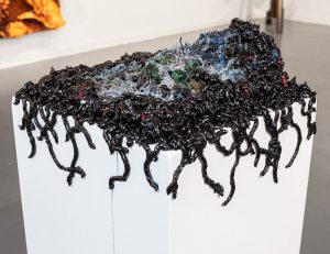
Pierce: Now I am gravitating towards this piece because it has a similar vibe to these two I see on the walls. One seems to be an ocean scene with either weird waves on the wall, or what appears to be a man being overtaken by them. And on the other wall, there’s a piece with an outline of a person in cardboard pieces.
This specific work though, sitting on a pedestal, has a noticeable multitude of glossy black strands.
Sandra: It looks like poop. [Laughing]
Pierce: I would go to a doctor if it looked like that though.
Sandra: Yeah. And it’s falling over the side of it. It appears to have been made on the pedestal. It’s very aware of the edges, so it looks like gel was squeezed out, like paint straight from a big paint tube, a glossy black… You know what? It looks like Phthalo blue paint. I can see it because some of it–when it was squeezed out onto the pedestal–it came down the side a bit thinner and revealed the color.
Pierce: Now that you point it out, I agree. But I would say midnight [blue]. There’s also this mossy landscape mixed in with the paint. It looks practically hellish with blues, some green, and even some red mixed throughout this mossy substance. One might even consider it almost alien.
Sandra: Now that I’m getting closer, it looks like they painted the landscape part. In the center of it, it seems like [they used] a sponge or artificial grass, flocking, or something you might find as shrubbery in a miniature train garden.
Pierce: The paint makes the landscape appear deoxygenated. It’s necrotic, almost. It looks like it’s dying and being overtaken by the sludge, which you could think of as oil, coal, or other pollutants.
Sandra: There’s some other substance besides the paint to make it look like a destroyed miniature landscape, which has the texture of organic material, like trees, bushes, and more.
Pierce: It’s being overwhelmed by this substance. It’s being consumed by something toxic.
Sandra: Of course, the title [of the exhibition], Organic Destruction–definitely rings true to that. Now I smell the paint! The artist had to kill a lot of paint for this sculpture. Now I want to know how they put this together. To me, it says, “they’ve got this landscape destroyed by this creature, an alien virus, or slime, which is taking over and devouring this world.” It’s nightmarish.
Pierce: I understand how you see it as something extra-terrestrial or virus-like. But I see it as more like pollutants or human waste, not unlike a landfill. We have this large area we dedicate to garbage that is spreading. And eventually, when is it going to completely overtake the livable and natural space?
Sandra: It looks like when it’s finished with the devastation of this organic area, it will move on to the next island. It’s not like lava that just pours down the spot, but rather, it’s alive.
Pierce: It almost looks like it’s coming onto the land. True, some of it is straggling off to the sides, but I see it as climbing up or piling up. It also feels like there are these last vestiges of life, represented by the green we do see. And they are either slowly turning that bluish color and dying, or they are getting subsumed or eaten by this sludge.
Sandra: It’s got a War of the Worlds feel to it as if it is an invading species, and it’s depressing. It feels like science fiction. I hope it remains that way. Just a fiction.
Julia Glatfelter, Don’t Take No Wooden Nickels, 2020, oil, 18” x 17” Photo: Courtesy Creative Alliance
JULIA GLATFELTER: WHAT WE HEARD
Dates: April 17th to May 29th
Artist: Julia Glatfelter
Online: https://www.creativealliance-onview.org/julia-glatfelter-what-we-heard
CREATIVE ALLIANCE AT THE PATTERSON
Amalie Rothschild Gallery
3134 Eastern Avenue
Baltimore, MD 21218
Instagram Facebook Twitter
info@creativealliance.org
Upstairs in the Amalie Rothschild Gallery What We Heard shows a modest collection of portraits by Baltimore artist, Julia Glatfelder. Nine oil paintings hang on three sides of the 30’ x 30’ gallery and encircle a sculptural element suspended in the center. Hanging from a grid well above our heads are several embroidery hoops of assorted sizes. Suspended from the hoops, like paper wind chimes, are yard-long strips of white paper with various phrases written on them. The phrases were obviously penned using the colorful Magic Makers stationed on a pedestal low enough for a four-year-old to reach in the middle of the gallery. A sheet of instructions for visitors lays next to the pens.
Sandra: I don’t know if I’m weary from the heavy show downstairs, the 30 steps we just climbed, or both. So what’s up here?
Pierce: The paintings on the walls of this exhibit are overwhelmingly portraiture rather than other subject matter.
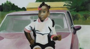
Sandra: Children. They’re all portraits of children. Some are close-ups. Some are candid. Were they posing for photos? One child is playing a piano. I see one child on the phone, an older rotary-style phone.
Pierce: Perhaps I am wrong, but it looks like there is a different level of detail across the portraits. The eyes in this one, where we see a girl sitting on the hood of a car, the eyes blend in with her face, only being able to tell where they are because they’re like slightly off-color.
Sandra: I think the whole painting is that way too. It’s not hugely detailed. It’s impressionistic. The foliage in the background makes it look like the car is parked in a driveway or something.
Pierce: That’s what I was wondering. Is this yellow object in the background a house, or are they in front of some kind of dumpster, or what is it exactly? But aside from that one thing, I would almost say they’re in a park, or in the parking lot of one.
Sandra: The car is a very boxy 1970s car. It looks older too, like the painting with the older phone. I wonder if these were all from pictures that were taken some time ago.
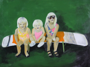
Julia Glatfelter, Many Hands Make Light Work, 2020, oil, 18” x 24” Photo: Courtesy Creative Alliance
Sandra: Even that lawn chair in the painting with the three little girls sitting on it looks older. I remember that chair style from the mid-seventies. You just don’t see those anymore. I really like this one. The portrait was taken with three children, presumably siblings, all with similarly cut blonde hair, sitting on one laid-flat lawn chair from the 70s. As a result, it looks like they’re cut and pasted onto this flat field of green in the background. I like the abstract quality of it–like a Hopper or a David Hockney painting. You can’t see any of their eyes. They’re darkened as they’re squinting in the sun, sitting in their bathing suits. It’s adorable. The little child looks like she’s smiling. It looks like they’ve been told to sit there and get their picture taken before they get into the pool, evident by the fact their hair is still dry.
Pierce: I assume so. Overall, just looking at this exhibit, I would say it’s wholesome. One, because it’s the subject of children, but two the photos and paintings are innocent and joyful, many of the children smiling and just being kids.
Sandra: That’s the feeling I get too: wholesome. That’s a good word. It’s definitely not a Balthus Show. I feel like they may have been taken from portraits that were…
Pierce: Photographic portraits, or even miscellaneous photos from a memory album.
Sandra: Exactly! Like the photos weren’t taken at the time for the purpose of being painted for a gallery show. They were just laying around in old family album photos.
Pierce: Actually, in the exhibit’s description, they referred to the artist’s friends making contributions to the exhibit. Perhaps when they were referring to the contributions of friends, maybe it was those photos from the artist’s friends, which were then used to make these paintings.
Sandra: Now, in the center of the exhibit, there are seven embroidery hoops hanging from the ceiling grid.
Pierce: Each has about, say… eight strips of paper hanging off of them. They all have different expressions and sayings on them.
Sandra: They have phrases written on them using Magic Markers–probably those on the pedestal over here. Are we supposed to write something too? Is this an interactive piece?
Pierce: It certainly appears to be an interactive piece. The instructions on the pedestals say, “Unclip a paper from the mobile. Think of a phrase that you heard growing up a lot. It could be positive or negative. Write your answer on the paper with a marker, then hang your paper on the mobile.”
They have various expressions, both positive and negative.
“Because I said so.”
“You can do this.”
“Life isn’t fair.”
“I guess that means take wooden nickels.”
“Always look your best.”
Some expressions are even in foreign languages. I believe I am looking at one written in Korean. Some appear to have been collaborative, One is composed using four different markers saying, “You’re a good person, but you’re too naive and that can get you hurt.”
Sandra: I don’t know if you want to, but I guess we should participate. I can’t think of anything. I guess it could be positive.
Pierce: Yes. We should write one.
Sandra: Okay. Well, I just wrote something totally unremarkable. I may have heard it, but I can’t be certain.
We leave the Creative Alliance an hour after we arrived.
On the way to our cars, we stop for a chat when we run into one of the gallery’s resident artists, with whom we are both acquainted. Her studio loft is just above the main gallery space, inside the old Patterson building. We manage to have a small catch-up, discuss how we all know one another, and talk about our respective happenings to this point. But, individual obligations eventually force us to part ways.
That’s how it goes in Baltimore. Everyone knows everyone. And it’s a small, small (art) world here too. I guess that’s why they call it “Smalltimore.”